Making Sense of Data in the 2019 General Election
Statistics were everywhere over the course of the United Kingdom’s election campaign. Some have been good, and others – from parties of all stripes – have been misleading, inaccurate, or in some cases, downright false.
The Liberal Democrats have always had an unfortunate relationship with bar charts (messing around with axes, or using irrelevant local/European election data to make their chances look better than they are). But their charts reached new levels of misleading at this election. Take this example, from Jacob Rees Mogg’s constituency, North Somerset:
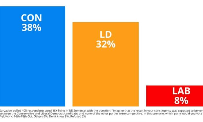
Looks fair enough – a poll shows that Labour can’t win in that seat. But look at the small print. The poll relates to the question: “Imagine that the result in your constituency was expected to be very close between the Conservative and Liberal Democrat candidate, and none of the other parties were competitive. In this scenario, which party would you vote for?” Given this, it’s amazing that Labour got as many votes as they did. As it happened, the advice wasn’t altogether wrong – Labour didn’t have a chance of winning the seat. Unfortunately, nor did the Lib Dems.
The Tories were also criticised at a number of points for their use of numbers in the election, in particular regarding the NHS.
But this got them in hot water in this election. First they claimed that they would build 40 new hospitals, but it turns out they had only put funding in place for six, and these were hospitals that actually already existed (so as well as getting a new hospital, you’d lose an old one). Then, they claimed they would hire 50,000 new nurses. But it turns out 19,000 of these are already nurses, who would be ‘retained.’
It’s a bit of a stretch to say that a nurse who hasn’t left is a ‘new’ nurse, but it goes to show how easily numbers can be twisted to say things they don’t mean. One could argue that good policies that keep old nurses are as valuable as policies to recruit new nurses. But that isn’t the same thing as getting new nurses.
The Conservatives were not alone in stretching the boundaries of numbers. Labour’s manifesto, which promised a huge amount, might have looked too good to be true (and probably did to the voters). But Labour said their plans were “fully costed”.
This sounds impressive. The problem is that any costing requires one to make some pretty big assumptions about what will happen to the population, jobs and the economy over the course of a few years. Labour claimed that they would nationalise a number of sectors, but couldn’t say how much doing so would cost.
That isn’t to say that Labour’s assumptions were necessarily wrong, nor that they were any worse than the assumptions of any other parties. But the claim that their plans were fully costed is dubious. Indeed, the Institute for Fiscal Studies argued that neither Labour nor the Conservatives had credible spending plans.
It wasn’t just politicians making a mess of their statistical claims. On a November episode of the BBC’s Question Time, a member of the public claimed he was not in the top 5 percent of earners, despite earning £80,000 per year. In fact, he claimed he wasn’t even in the top 50 percent.
He was wrong, of course. The median household income in this country is under £30,000, and anyone earning over around £70,000 is in the top 5 per cent of earners.
If you live surrounded by people earning lots, it’s easy to forget that not everyone else is in the same position, especially when you might have your own difficulties paying mortgages, saving for holidays, and so on. But it is a bad sign for public understanding of society and its problems, when it’s possible to believe that you are struggling by on £80,000.
Having given all these examples of bad stats, it should be said that it is not all bad and there were many examples where, in fact, statistics were used really well.
One of these was polling. Many of the pollsters called the election almost exactly right. And, aside from the Conservative Party, the winner of the election was arguably the statisticians and political scientists who ran the election night exit poll, which sampled voters from just 150 polling stations around the country, but was able to predict the result almost exactly. The power of statistics to tell us important things about politics, and about society, remains strong.
The problem is that often statistics are not the final objective answer to things. They can be interpreted in lots of different ways, even when none of those ways is wrong per se. That opens up a space for public debate, which is good news, but it also opens up a space where statistics can either be lauded as the truth (when they are not), or dismissed out of hand as ‘biased’.
In this election we had lots of excellent fact checking sites helping to sort the fact from the fiction. But even these weren’t impervious to accusations of bias, and when the Conservative Party’s Twitter feed rebranded itself as ‘FactCheckUK’ for the duration of an election debate, it showed a contempt for both fact checking websites and, arguably, the truth itself. ‘Fake news’ is increasing, often distributed by foreign agents or by politicians themselves.
This presents a challenge for journalists, and for the general public. Journalists must be wary of statistics reported by politicians. They cannot continue to repeat them verbatim, without context and without scrutiny. Journalists need to learn how to spot statistics that are misleading, controversial, and in some cases just plain wrong.
But the general public needs to do the same. If you want to be sure you aren’t being hoodwinked by politicians or journalists, you need to learn to interpret and understand how statistics can be misused.
That’s what our new book, Making Sense of Data in the Media, is trying to do – to help readers see through the headlines and understand the numbers that lie beneath them. It can be used to add colour and relevance to statistics courses at school or university, or in its own right to help readers understand the world of information and numbers we live in.
We need to take responsibility for our own understanding of what is told to us, and in the process, take responsibility for our own democracy.