We Know Little About How Data Viz Affects Our COVID Perceptions
There have never been so many line charts, bar charts and choropleth maps occupying the news, as simple data visualizations have become key to communicating vital information about the coronavirus pandemic to the public. Whilst these terms might not be familiar to all, the visualizations themselves certainly are.
One line chart has even become famous, entering into the everyday vocabulary of the pandemic. I’m referring to the ‘flatten the curve’ line chart explaining the need to slow down the spread of coronavirus in order not to overwhelm healthcare services. Notably, a New York Times article led with said line chart, an unusual move in news journalism, which more frequently leads with a human interest visual like a photograph and provides data in charts and graphs below the line. Variations of the flatten the curve line chart have since abounded, so much that visualization designer Andy Kirk joked: we need to “flatten the curve of new versions of the flatten the curve chart.”
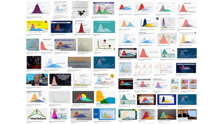
Adapted from Andy Kirk, via Twitter
Other coronavirus data visualizations also proliferate. The BBC’s ‘visual guide to the pandemic‘ includes bar charts, interactive maps and line charts showing change over time. Elsewhere, the Financial Times is offering free content incorporating more challenging chart types, like stream graphs and stacked bar charts. The New York Times has been mapping the spread of the virus from its early days, changing what it maps and how it maps as the pandemic unfolds. Worldometers visualizes real-time data about the virus, and individual data visualizers are also taking it upon themselves to represent virus data, such as David McCandless’s coronavirus datapack at Information Is Beautiful.
At this time of massive global crisis, it feels almost trivial to write about visual representations of data, but they play a significant role, and the public’s ability to make sense of them has never been more important. Proponents argue that visualizations promote greater understanding of data by making them accessible and transparent, or that, through visualization, it is possible to ‘do good with data,’ the trademarked tagline of US-based visualization agency Periscopic.
However, the benefits of data visualization are only half the story. Some argue that data visualizations can do ideological work, privileging certain views of the world and hiding others, or perpetuating existing power relations. Visualizations are not neutral windows onto data; rather, they are the result of “judgement, discernment and choice.” On April 29, for example, the UK government decided to start press pack line graphs of global death comparisons on the day each country recorded its 2000th death, where these graphs had previously started on the that 50th deaths were recorded. This decision obscured the exponential rise in UK deaths compared to other countries. Moving goalposts, as commentators noted on Twitter.


Source, Prime Minister’s Office (Open Government Licence v3.0)
The data on which visualizations are based are also not neutral. Human decisions influence and shape data, as well as their visual representation. Data are never ‘raw’: the very concept of raw data, as Geoffrey Bowker put it, is an oxymoron. Not surprisingly then, the data on which coronavirus maps, charts and dashboards are based are fiercely contested. Data are hard to gather – counting is difficult – but they are also political. There is widespread debate about what data is known but not shared, and who is included and excluded in data about death rates. The Open Data Institute’s Jeni Tennison calls for more openness about data in order to tackle the crisis in the UK, author Cathy O’Neil gives us 10 reasons to doubt coronavirus data, and Bonnie Kristian suggests that coronavirus data visualization is at best a “distorted little sketch.”
What constitute ‘good’ and ‘bad’ data practices is subject to debate, and the topic takes on new dimensions in times of crisis. Forms of data sharing that seemed impossible last month, such as the sharing of health data with supermarkets, are increasingly normal. Notions of public interest, ethics and justice become ever more embattled at times like these, in relation to data and their visual representation as well as in other realms.
Thinking critically about these issues is an important skill for making sense of the data visualizations that are currently circulating. Research that I undertook with others in 2015 suggested that people lacked confidence in their own ‘graphicacy.’ or the combination of maths, visual literacy, language, computing and critical thinking skills that are needed to make sense of graphs and charts. But since that research was undertaken, data visualizations have become more commonplace, especially in the simple and standardiszed formats of bar charts and line charts that proliferate today and that were not the subject of that early research. Designers believe that the circulation of such visualizations on social media make people both too naïve and too skeptical about their truthfulness. But this is speculation: we need to know more about the actual role that these ‘generic visuals’ play in making knowledge, engagement and action possible, and how social inequalities limit these possibilities for certain groups.
It’s possible, of course, that non-standardised visualizations about coronavirus are more effective at communicating data than simple bar and line charts. In Data Visualization in Society (a book I co-edited with Martin Engebretsen), Jill Simpson draws on her experience of producing a hand drawn data visualization about her obsessive compulsive disorder to explore how hand drawing communicates a sense of intimacy, authenticity and honesty. Hand drawing evokes emotions, she argues, an important element in data visualization, as my early research revealed. For me, some of the most effective and affecting coronavirus data visualizations are the hand-drawings of data journalist Mona Chalabi and the cartoon-like animations of microbiologist Siouxsie Wiles and illustrator Toby Morris. These have shown, amongst other things, how the virus spreads more quickly in densely populated areas, how social distancing works, who has the privilege of being able to work from home, and the ways in which the virus is disproportionately affecting black Americans. They deploy the suggested qualities of the hand-drawn to reveal the politics of the pandemic.
As generic visuals like bar and line charts increasingly populate the news and social media, we need more understanding of their social role. Do they bring people together around shared interests and concerns, activate them to care (or not) about issues, make possible (or not) various forms of engagement, facilitate or inhibit the spread of disinformation? For governments and researchers looking to communicate public health information, finding out how simple data visualisations influence the public is now more pressing than ever.
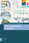
The book Data Visualization in Society, edited by Martin Engebretsen and Helen Kennedy and published by Amsterdam University Press, is available to read open access here.
“Generic visuals in the news” is a research project funded by the Arts and Humanities Research Council which will commence in September 2020.