


Could Distributed Peer Review Better Decide Grant Funding?
The landscape of academic grant funding is notoriously competitive and plagued by lengthy, bureaucratic processes, exacerbated by difficulties in finding willing reviewers. Distributed […]
The landscape of academic grant funding is notoriously competitive and plagued by lengthy, bureaucratic processes, exacerbated by difficulties in finding willing reviewers. Distributed […] Look closely at your mobile phone or tablet. Touch-screen technology, speech recognition, digital sound recording and the internet were all developed using […] In its first 100 days, the Trump administration terminated more than US$2 billion in federal grants, according to a public source database […] Britain’s Academy of Social Sciences has named University of Edinburgh politics professor Christina Boswell FBA FAcSS FRSE as the new chair of […] Daniel Goroff, a mathematician and economist with a long pedigree of policy roles at the intersection of the social sciences and public […] Critical thinking is an important skill, but in practice, it’s often taught in isolated moments rather than as something students can and should use every day. At a […] A photograph of Earth glowing in deep space, the Moon’s cratered horizon stretching across its foreground, caught many people’s eyes in April […] Geographer Catherine Nakalembe, an assistant professor at the University of Maryland, and here she details the intersection of artificial intelligence, mapping technology […] I was adding some final flourishes on the topic of ‘iatrocracy’ to my forthcoming book with Natewindé Sawadogo – Sickness and Social […] In the second episode of this four-part series on The Authority File, Tracey Brown, director of Sense about Science, and Camille Gamboa, […] An examination of the public’s trust in science, and ways to buttress that precious commodity, center a four-part series of podcasts presented […] Sage (the parent of Social Science Space) and Surviving Society’s collaborative podcast series, Social Science for Social Justice, has returned for a […] In the United Kingdom, thousands of Palestine Action protestors have been arrested and charged with supporting terrorism. After the dreadful 7 October […] In the November edition of The Evidence, Josephine Lethbridge explores an historic shift in global wealth – and its potential to reshape charitable giving. Over the coming decades, […] In a new white paper by Tom Chatfield, the philosopher of tech and critical thinking outlines a practical roadmap for integrating artificial intelligence into […] ‘What Do We Know and What Should We Do About the Irish Border?’ is a new book from Katy Hayward that applies social science to the existing issues and what they portend. Brexit seems likely to extend the hostility of the UK immigration system to scholars from European Union countries — unless a significant change of migration politics and prevalent public attitudes towards immigration politics took place in the UK. There are no indications that the latter will happen anytime soon. A new report from the Royal Society about the effects on Brexit on science in the United Kingdom has our peripatetic Daniel Nehring mulling the changes that will occur in higher education and academic productivity. Although many may think of accounting as something abstract that happens only in spreadsheets, a new study shows that accounting can impact […] Despite decades of reform, gender pay gaps (GPGs) remain a stubborn and unjust feature of labour markets globally. On average, women are […] In this article, Lorenzo Skade discusses the emotional difficulties encountered by early-career researchers involved in ethnographic studies within the business and society […] Britain’s Academy of Social Sciences has named University of Edinburgh politics professor Christina Boswell FBA FAcSS FRSE as the new chair of […] Daniel Goroff, a mathematician and economist with a long pedigree of policy roles at the intersection of the social sciences and public […] Michael Burawoy, whose embrace of public sociology and the public at work lead him to describe his influential academic niche as “industrial […] The National Academies’ Committee on National Statistics seeks nominations for members of an ad hoc consensus study panel — sponsored by the U.S. Census Bureau — to review and evaluate the quality of the 2020 Census. Could the 2020 iteration of the United States Census, the constitutionally mandated count of everyone present in the nation, be the last of its kind? Census data can be pretty sensitive – it’s not just how many people live in a neighborhood, a town, a state or […] For years, we’ve been told a familiar story: social scientists such as economists, management scholars, sociologists, talk and the public shrugs. The […] On this platform, growing attention is paid to structural issues in academia, including trust in science and the role of metrics and rankings. In the […] In September 2025, The Guardian reported about a lawyer in Australia having faced sanctions due to false citations. These citations were not […] You’ve likely heard the hype around artificial intelligence, or AI, but do you find ChatGPT genuinely useful in your professional life? A free course offered by Sage Campus could change all th How is AI changing the shape and space of higher education? Critical thinking continues to rank highly among key skills and attributes […] The challenge: Students tend to perceive attractive looking results as more trustworthy. This is the aesthetic bias, a behavioral phenomenon where humans […] A few years ago, if you asked students where they began their research, the answer was predictable: “Google” or “Google Scholar.” Today, […] A photograph of Earth glowing in deep space, the Moon’s cratered horizon stretching across its foreground, caught many people’s eyes in April […] It’s become cliche since Clive Humbly coined it in 2006, but data is indeed the new oil. It’s a mantra repeated by […] It’s not news to those in library-land that book bans and censorship in higher education have serious implications for the future of […] Sage’s 7th-annual Critical Thinking Bootcamp is a free online event providing practical tools for academic librarians and faculty to support AI literacy […] The purpose of the Association for Interdisciplinary Meta-Research and Open Science (AIMOS) is to make the research process more trustworthy and efficient, […] Historian Rana Mitter OBE FBA, the S.T. Lee Professor of U.S.-Asia Relations at The Harvard Kennedy School, will address ‘China, the US […] Thanks to a collaboration between the Inter-American Foundation (IAF) and the Social Science Research Council (SSRC), applications are now being accepted for […] What is the best strategy for finding someone missing in the wilderness? It’s complicated, but the method known as ‘Lost Person Behavior’ seems to offers some hope. The President’s Management Agenda Learning Agenda: Public Participation & Community Engagement Evidence Challenge is dedicated to forming a strategic, evidence-based plan that federal agencies and external researchers can use to solve big problems. Artificial intelligence has crossed a threshold in the modern workplace. It is being used for everything from helping employees manage schedules to […] Until recently, AI’s role in research felt like having a useful assistant. It could summarize a paper, clean up a dataset or […] Scientific discoveries rarely happen alone. Modern research often involves teams spanning institutions and even countries. Yet when research is published in academic […] Political scientist Adam Seth Levine, the SNF Agora Professor of Health Policy and management at the SNF Agora Institute at Johns Hopkins, focuses […] Political scientist Kenneth Prewitt, a keen observer of the role of social science in the larger world who used his observations to […] Every guest on the Social Science Bites podcast is queried about their area of expertise, and hence the questions tend to differ […] As part of its ongoing commitment to academic freedom, Sage, the parent of Social Science Space, hosted a panel discussion at the 2026 […] A photograph of Earth glowing in deep space, the Moon’s cratered horizon stretching across its foreground, caught many people’s eyes in April […] Geographer Catherine Nakalembe, an assistant professor at the University of Maryland, and here she details the intersection of artificial intelligence, mapping technology […] Britain’s Academy of Social Sciences has named University of Edinburgh politics professor Christina Boswell FBA FAcSS FRSE as the new chair of […] How is AI changing the shape and space of higher education? Critical thinking continues to rank highly among key skills and attributes […] Daniel Goroff, a mathematician and economist with a long pedigree of policy roles at the intersection of the social sciences and public […] I was adding some final flourishes on the topic of ‘iatrocracy’ to my forthcoming book with Natewindé Sawadogo – Sickness and Social […] How is AI changing the shape and space of higher education? Critical thinking continues to rank highly among key skills and attributes […] My colleagues and I recently spoke with a group of talented, interesting students who just completed their first year of college about […] A clunky booking website and my failure to check dates before pressing ‘buy’ meant that I saw Christopher Nolan’s The Odyssey on […] In 1990, David McCune and Gracia Alkema launched Corwin Press with the goal of putting educational research and theory into practice for […] As the US-Israeli war on Iran and Lebanon drags on, bringing the world economy to the brink of collapse, U.S. President Donald […] A clunky booking website and my failure to check dates before pressing ‘buy’ meant that I saw Christopher Nolan’s The Odyssey on […] As part of its ongoing commitment to academic freedom, Sage, the parent of Social Science Space, hosted a panel discussion at the 2026 […] The United States has a long history of celebrating its diverse communities with observances throughout the calendar year. Hispanic Heritage Month, Black History Month, […] A clunky booking website and my failure to check dates before pressing ‘buy’ meant that I saw Christopher Nolan’s The Odyssey on […] As part of its ongoing commitment to academic freedom, Sage, the parent of Social Science Space, hosted a panel discussion at the 2026 […] David Canter explores the three interacting corrosive cycles that destroys democracies – limiting effective education, destroying a free press and limiting the […] Qualitative data analysis is a way of creating insight and empathy. Strategies for data analysis and interpretation are tools for meaning-making and […] Sometimes a book jumps off my shelf and comes to life. Visual research is easier said than done. It seems simple, in […] The word censorship might bring to mind authoritarian regimes, book-banning, and restrictions on a free press, but Cory Clark, a behavioral scientist at […] Earlier this week, Canada’s Social Sciences and Humanities Research Council announced that $289 million has been allocated to support 1,788 social sciences and […] As a university researcher focused on education, I have spent hundreds of hours designing studies to help the field and that might […] Since its inception, the Bill and Melinda Gates Foundation has made grant payments totaling more than $90 billion. These grants have gone […] Who drives digital change – the people of the technology? Katharina Gilli explains how her co-authors worked to address that question. The negative consequences of relying too heavily on metrics to assess research quality are well known, potentially fostering practices harmful to scientific research such as p-hacking, salami science, or selective reporting. To address this systemic problem, Florian Naudet, and collegues present six principles for assessing scientists for hiring, promotion, and tenure. Candace Jones, Mark Lorenzen, Jonathan Sapsed , eds.: The Oxford Handbook of Creative Industries. Oxford: Oxford University Press, 2015. 576 pp. $170.00, […] The United States has a long tradition of celebrating its diverse communities with heritage observances throughout the calendar year. And yet not […] The grudging disclosure of the Jeffrey Epstein files by the US government has rightly attracted a great deal of commentary. The responses […] Eighty years ago this month, the United Kingdom pioneered a novel form of social science research, the life-long cohort study. The tool […] The Canadian Federation of Library Associations recently proposed providing secondary publishing rights to academic authors in Canada. The U.S. National Science Foundation and the American Association for the Advancement of Science have teamed up present a 90-minute online session examining how to balance public access to federally funded research results with an equitable publishing environment. Five organizations representing knowledge networks, research libraries, and publishing platforms joined the Federation of Humanities and Social Sciences to review the present and the future of open access — in policy and in practice – in Canada As the US-Israeli war on Iran and Lebanon drags on, bringing the world economy to the brink of collapse, U.S. President Donald […] Since its inception, the Bill and Melinda Gates Foundation has made grant payments totaling more than $90 billion. These grants have gone […] On this platform, growing attention is paid to structural issues in academia, including trust in science and the role of metrics and rankings. In the […] As the U.S. Congress debates the reauthorization of the Higher Education Act, a new paper in Policy Insights from the Behavioral and Brain Sciences urges lawmakers to focus on provisions aimed at increasing the numbers of black and Latinx teachers. To help in decisions surrounding the effects and aftermath of the COVID-19 pandemic, the the journal ‘Policy Insights from the Behavioral and Brain Sciences’ offers this collection of articles as a free resource. Psychologist Susan Fiske was the founding editor of the journal Policy Insights from the Behavioral and Brain Sciences. In trying to reach a lay audience with research findings that matter, she counsels stepping a bit outside your academic comfort zone. SAGE Publishing — the parent of Social Science Space – will hold its Third Annual Critical Thinking Bootcamp on August 9. Leaning more and register here On May 13, the American Academy of Political and Social Science hosted an online seminar, co-sponsored by SAGE Publishing, that featured presentations […] On Friday, April 23rd, join the Population Association of America and the Association of Population Centers for a virtual congressional briefing. The […] For years, we’ve been told a familiar story: social scientists such as economists, management scholars, sociologists, talk and the public shrugs. The […] Media algorithms and artificial intelligence are pretty good at feeding us content we want (and lots of it), but not necessarily information […] What does one do on a wet Sunday afternoon in Lyon, France? The shopping malls are closed, as are many of the […] As the US-Israeli war on Iran and Lebanon drags on, bringing the world economy to the brink of collapse, U.S. President Donald […] For years, we’ve been told a familiar story: social scientists such as economists, management scholars, sociologists, talk and the public shrugs. The […] As a university researcher focused on education, I have spent hundreds of hours designing studies to help the field and that might […] Britain’s Academy of Social Sciences has named University of Edinburgh politics professor Christina Boswell FBA FAcSS FRSE as the new chair of […] Kaye Husbands Fealing, an economist who has done pioneering work in the “science of broadening participation,” has been named the new leader of the U.S. National Science Foundation’s Directorate for Social, Behavioral and Economic Sciences. Clinical psychologist Jane M. Simoni has been named to head the U.S. National Institutes of Health’s Office of Behavioral and Social Sciences Research Nobel laureate economist Esther Duflo has been named the American Academy of Political and Social Science’s 2026 Daniel Patrick Moynihan Prize winner. The […] Britain’s Academy of Social Sciences has named University of Edinburgh politics professor Christina Boswell FBA FAcSS FRSE as the new chair of […] The American Academy of Political and Social Science has elected two academics and one journalist as its 2026 fellows. The three – […] “Research impact” means different things to different people. Some refer broadly to how science changes behaviors, beliefs, or practices outside academic institutions. […] A 2024 report by the National Academies explores the latest advances in artificial intelligence (AI) technology and their potential effects on economic productivity, job stability, and income inequality. It also highlights key research opportunities and data needs to help workers and policymakers adapt to the evolving AI landscape. To address racial and ethnic inequalities in the U.S. criminal justice system, the National Academies of Sciences, Engineering and Medicine just released “Reducing Racial Inequality in Crime and Justice: Science, Practice and Policy.” The social and behavioral sciences supply evidence-based research that enables us to make sense of the shifting online landscape pertaining to mental health. We’ll explore three freely accessible articles (listed below) that give us a fuller picture on how TikTok, Instagram, Snapchat, and online forums affect mental health. With research-based evidence increasingly being seen in policy, we should acknowledge that there are risks that the research or ‘evidence’ used isn’t suitable or can be accidentally misused for a variety of reasons. Over a 10-year period Carol Tenopir of DataONE and her team conducted a global survey of scientists, managers and government workers involved in broad environmental science activities about their willingness to share data and their opinion of the resources available to do so (Tenopir et al., 2011, 2015, 2018, 2020). Comparing the responses over that time shows a general increase in the willingness to share data (and thus engage in Open Science). Anthropic, the company behind the generative AI tool Claude, claimed in March 2026 that it used an AI interviewer to conduct “the […] Artificial intelligence has crossed a threshold in the modern workplace. It is being used for everything from helping employees manage schedules to […] Scientific discoveries rarely happen alone. Modern research often involves teams spanning institutions and even countries. Yet when research is published in academic […] Eighty years ago this month, the United Kingdom pioneered a novel form of social science research, the life-long cohort study. The tool […] Researchers are dealing with a disturbing trend that threatens the foundation of scientific progress: scientific fraud has become an industry. And it’s […] The team at the San Francisco Declaration on Research Assessment, or DORA, is celebrating its 12th birthday by launching “A Practical Guide to […] As part of its ongoing commitment to academic freedom, Sage, the parent of Social Science Space, hosted a panel discussion at the 2026 […] Political scientist Adam Seth Levine, the SNF Agora Professor of Health Policy and management at the SNF Agora Institute at Johns Hopkins, focuses […] Quick Insight is a series of short videos in which experts from academe and the larger community surrounding the academy address a […] In 2011, anti-government protests and uprisings erupted in Northern Africa and the Middle East in what is often called the “Arab Spring.” […] Dr. Liz Przybylski was thinking ahead when she wrote Hybrid Ethnography: Online, Offline, and In Between. They unwittingly predicted that we would […] Qualitative data analysis is a way of creating insight and empathy. Strategies for data analysis and interpretation are tools for meaning-making and […] The Northern Hemisphere is experiencing its regular seasonal increase in viral respiratory infections. Traditional schedules have not fully adjusted post-Covid so influenza […] Media algorithms and artificial intelligence are pretty good at feeding us content we want (and lots of it), but not necessarily information […] What does one do on a wet Sunday afternoon in Lyon, France? The shopping malls are closed, as are many of the […] One of the promises of artificial intelligence is that it will mimic, and perhaps even improve, on human thinking. One of those […] The human brain works very hard behind the scenes even in the most mundane aspects of daily life, like enjoying a nice […] Tom Gilovich finds it fun to study the whys and wherefores of how human beings make sense of the information delivered by […] In 1990, David McCune and Gracia Alkema launched Corwin Press with the goal of putting educational research and theory into practice for […] How is AI changing the shape and space of higher education? Critical thinking continues to rank highly among key skills and attributes […] My colleagues and I recently spoke with a group of talented, interesting students who just completed their first year of college about […] In the first post from a series of bulletins on public data that social and behavioral scientists might be interested in, Gary Price links to an analysis from the Transactional Records Access Clearinghouse. The next in SAGE Publishing’s How to Get Published webinar series focuses on promoting your writing after publication. The free webinar is set for November 16 at 4 p.m. BT/11 a.m. ET/8 a.m. PT. The next in SAGE Publishing’s How to Get Published webinar series honors International Open Access Week (October 24-30). The free webinar is […] At a time when there are so many concerns being raised about always-on work cultures and our right to disconnect, email is the bane of many of our working lives. The interactional skill of large language models enables them to carry out qualitative research interviews at speed and scale. Demonstrating the ability of these new techniques in a range of qualitative enquiries, Friedrich Geiecke and Xavier Jaravel, present a new open source platform to support this new form of qualitative research. The Accelerator For Innovation and Research Funding Experimentation (AFIRE) is a new tool dedicated to boosting and revitalizing the design, synthesis, and implementation of experiments through innovation and research funding. A new database houses more 250 different useful artificial intelligence applications that can help change the way researchers conduct social science research. As part of its ongoing commitment to academic freedom, Sage, the parent of Social Science Space, hosted a panel discussion at the 2026 […] Political scientist Adam Seth Levine, the SNF Agora Professor of Health Policy and management at the SNF Agora Institute at Johns Hopkins, focuses […] Quick Insight is a series of short videos in which experts from academe and the larger community surrounding the academy address a […] In 2024, Sage surveyed social and behavioral science (SBS) researchers from 96 countries to better understand their motivation, if any, to conduct […] Are your students anxious about learning methods? How to teach research methods without resorting to a quant-qual divide? Do your students struggle […] When Canadian Prime Minister Mark Carney denounced the so-called ‘rule-based world order’ as ‘fiction’ that was covering up the ‘asymmetries,’ no one […]
EXPLORE
Academic Funding

Could Distributed Peer Review Better Decide Grant Funding?
READ MORE

Cutting NSF Is Like Liquidating Your Finest Investment
READ MORE

How NIH Funding Works − Until It’s Gone
READ MORE
Announcements

Christina Boswell Named Chair of Campaign for Social Science
READ MORE
Sloan’s Danny Goroff to Take Reins at Social Science Research Council
READ MORE
Making Critical Thinking a Daily Habit: Sage’s Critical Thinking Challenge Winners
READ MORE
Artificial Intelligence

The Next Frontier: AI-Generated Images Undermining Trust in Science
READ MORE

Catherine Nakalembe on Geospatial AI
READ MORE

AI and ‘Iatrocracy’ – A Cautionary Tale
READ MORE
Audio

Steps to Increase Public Trust in Science
READ MORE

Podcast Series Dives into Public Curators Guide
READ MORE

Social Science for Social Justice Podcast Returns for Second Season
READ MORE
Bookshelf
Tackling the Drivers of Terrorism
READ MORE

Women Will Inherit Trillions in the ‘Great Wealth Transfer’ – What Will They Do With It?
READ MORE

A Box Unlocked, Not A Box Ticked: Tom Chatfield on AI and Pedagogy
READ MORE
Brexit

A Social Scientist Looks at the Irish Border and Its Future
READ MORE

Brexit and the Decline of Academic Internationalism in the UK
READ MORE

Brexit and the Crisis of Academic Cosmopolitanism
READ MORE
Business and Management INK

Can Accounting Impact Employee Wellbeing?
READ MORE

Closing the Gender Pay Gap: Why Intermediaries Matter
READ MORE

From Isolation to Impact: Tackling the Emotional Toll of Ethnographic Research in Business and Society
READ MORE
Career
Christina Boswell Named Chair of Campaign for Social Science
READ MORE
Sloan’s Danny Goroff to Take Reins at Social Science Research Council
READ MORE

Michael Burawoy, 1947-2025: Patron Saint of Public Sociology
READ MORE
Census
![]()
National Academies Seeks Experts to Assess 2020 U.S. Census
READ MORE

Will the 2020 Census Be the Last of Its Kind?
READ MORE

Will We See A More Private, But Less Useful, Census?
READ MORE
Communication

Social Science Expertise Need Credible Engagement to Reach the Public
READ MORE
How Publishers Extract Money, Labor, and Data from Universities
READ MORE

A Status Check on Hallucinated Case Law Incidents
READ MORE
Course

Free Online Course Reveals The Art of ChatGPT Interactions
READ MORE
Critical Thinking

The Critical Student: How GenAI Reshapes Critical Skills and Higher Education’s Role Preparing Students For It
READ MORE

The Visual Authority Trap
READ MORE

From ‘Which Database?’ to ‘Under What Conditions?’: Teaching Critical Thinking Through Search Tool Selection in an AI Age
READ MORE
Ethics
The Next Frontier: AI-Generated Images Undermining Trust in Science
READ MORE

Andrea Medina-Smith on Making Research Data More FAIR
READ MORE

The Ripple Effect of Book Bans on the Academy
READ MORE
Event

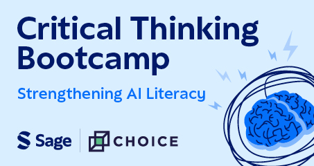
Critical Thinking Bootcamp: Strengthening AI Literacy
READ MORE
Association for Interdisciplinary Meta-Research and Open Science Annual Conference
READ MORE
Lecture: China, the US and Europe in the Era of Xi and Trump
READ MORE
Featured

New Fellowship for Community-Led Development Research of Latin America and the Caribbean Now Open
READ MORE

Exploring ‘Lost Person Behavior’ and the Science of Search and Rescue
READ MORE

New Opportunity to Support Government Evaluation of Public Participation and Community Engagement Now Open
READ MORE
Higher Education Reform

Who Do You Trust More: Your Colleagues or Your AI?
READ MORE

What Does It Mean Now That AI Is Creating Academic Papers?
READ MORE
Academic Authorship Confronts Ghosts, Gifts and Gender
READ MORE
Impact

Quick Insight: Adam Seth Levine on Research4Impact
READ MORE

Kenneth Prewitt, 1936–2026: At the Nexus of Academe, Policy and Philanthropy
READ MORE

Whose Work Most Influenced You? Part 6: A Social Science Bites Retrospective
READ MORE
Industry

Watch the Panel: Academic Freedom and the Role of the Academic Librarian
READ MORE
The Next Frontier: AI-Generated Images Undermining Trust in Science
READ MORE
Catherine Nakalembe on Geospatial AI
READ MORE
Infrastructure
Christina Boswell Named Chair of Campaign for Social Science
READ MORE
The Critical Student: How GenAI Reshapes Critical Skills and Higher Education’s Role Preparing Students For It
READ MORE
Sloan’s Danny Goroff to Take Reins at Social Science Research Council
READ MORE
Innovation
AI and ‘Iatrocracy’ – A Cautionary Tale
READ MORE
The Critical Student: How GenAI Reshapes Critical Skills and Higher Education’s Role Preparing Students For It
READ MORE

AI Doesn’t Drive Student Cheating. It Just Hitches a Ride
READ MORE
Insights

The Odyssey and the Social Order
READ MORE

Quick Insight: David McCune on Serving the Inherent Nobility of Teaching
READ MORE

A Predictable Failure: Trump’s Board of Peace
READ MORE
Interdisciplinarity
The Odyssey and the Social Order
READ MORE
Watch the Panel: Academic Freedom and the Role of the Academic Librarian
READ MORE
![]()
Celebrating Arab American Heritage Month
READ MORE
International Debate
The Odyssey and the Social Order
READ MORE
Watch the Panel: Academic Freedom and the Role of the Academic Librarian
READ MORE

Challenges to Democracy
READ MORE
Interview
Video Interview: Analyzing, Understanding, and Interpreting Qualitative Research from Interviews
READ MORE
Video Interview: Exploring Visual Research with Gillian Rose
READ MORE

A Behavioral Scientist’s Take on the Dangers of Self-Censorship in Science
READ MORE
Investment

Canada’s SSHRC Announces C$289 Million in Grants
READ MORE
A Promising Early-Career Researcher Details the Harms from Battering the NSF
READ MORE

Endowments and the Next New Deal: Thinking Bigger and More Creatively
READ MORE
Jobs

Digital Transformation Needs Organizational Talent and Leadership Skills to Be Successful
READ MORE

Six Principles for Scientists Seeking Hiring, Promotion, and Tenure
READ MORE
Book Review: The Oxford Handbook of Creative Industries
READ MORE
News

Recalling the Roots of Jewish American Heritage Month
READ MORE

JG Ballard and the Epstein Files
READ MORE

Celebrating the National Survey of Health and Development: 1946-2026
READ MORE
Open Access

Canadian Librarians Suggest Secondary Publishing Rights to Improve Public Access to Research
READ MORE

Webinar: How Can Public Access Advance Equity and Learning?
READ MORE

Open Access in the Humanities and Social Sciences in Canada: A Conversation
READ MORE
Opinion
A Predictable Failure: Trump’s Board of Peace
READ MORE
Endowments and the Next New Deal: Thinking Bigger and More Creatively
READ MORE
How Publishers Extract Money, Labor, and Data from Universities
READ MORE
PIBBS

The Added Value of Latinx and Black Teachers
READ MORE

A Collection: Behavioral Science Insights on Addressing COVID’s Collateral Effects
READ MORE
Susan Fiske Connects Policy and Research in Print
READ MORE
Posters
Presentations

Working Alongside Artificial Intelligence Key Focus at Critical Thinking Bootcamp 2022
READ MORE
Watch the Forum: A Turning Point for International Climate Policy
READ MORE
![]()
Event: Living, Working, Dying: Demographic Insights into COVID-19
READ MORE
Public Engagement
Social Science Expertise Need Credible Engagement to Reach the Public
READ MORE

New Guide Recognizes the Value of Good Curation
READ MORE

The Musée des Confluences: Celebrating Secularism and the Sciences
READ MORE
Public Policy
A Predictable Failure: Trump’s Board of Peace
READ MORE
Social Science Expertise Need Credible Engagement to Reach the Public
READ MORE
A Promising Early-Career Researcher Details the Harms from Battering the NSF
READ MORE
Recent Appointments
Christina Boswell Named Chair of Campaign for Social Science
READ MORE

Economist Kaye Husbands Fealing to Lead NSF’s Social Science Directorate
READ MORE

Jane M. Simoni Named New Head of OBSSR
READ MORE
Recognition
Economist Esther Duflo to Receive 2026 Moynihan Prize
READ MORE
Christina Boswell Named Chair of Campaign for Social Science
READ MORE
AAPSS Names Three as 2026 Fellows
READ MORE
Reports

Survey Finds Social Scientists Feel Unsupported in Seeking Societal Impact
READ MORE
NAS Report Examines Nexus of AI and Workplace
READ MORE

National Academies Looks at How to Reduce Racial Inequality In Criminal Justice System
READ MORE
Research

Analyzing the Impact: Social Media and Mental Health
READ MORE

The Risks Of Using Research-Based Evidence In Policymaking
READ MORE

Surveys Provide Insight Into Three Factors That Encourage Open Data and Science
READ MORE
Research

Qualitative Researchers Point Out The Limitations of AI’s Contributions
READ MORE
Who Do You Trust More: Your Colleagues or Your AI?
READ MORE
Academic Authorship Confronts Ghosts, Gifts and Gender
READ MORE
Research Ethics
Celebrating the National Survey of Health and Development: 1946-2026
READ MORE

Has Bad Science Become Big Busines
READ MORE
![]()
DORA to Launch Practical Guide to Responsible Research Assessment
READ MORE
Resources
Watch the Panel: Academic Freedom and the Role of the Academic Librarian
READ MORE
Quick Insight: Adam Seth Levine on Research4Impact
READ MORE

New Series Offers Quick Insights on Today’s Issues
READ MORE
Sage Research Methods

Using Video Data Analysis in the 21st Century
READ MORE
Exploring Hybrid Ethnography with Liz Przybylski
READ MORE
Video Interview: Analyzing, Understanding, and Interpreting Qualitative Research from Interviews
READ MORE
Science & Social Science

Why is It So Difficult to Agree About Masks and Respiratory Infections?
READ MORE
New Guide Recognizes the Value of Good Curation
READ MORE
The Musée des Confluences: Celebrating Secularism and the Sciences
READ MORE
Social Science Bites

Mahzarin Banaji on Social Cognition
READ MORE

Daniel Yon on the Brain as Scientist
READ MORE
![]()
Tom Gilovich On the Spotlight Effect
READ MORE
Teaching
Quick Insight: David McCune on Serving the Inherent Nobility of Teaching
READ MORE
The Critical Student: How GenAI Reshapes Critical Skills and Higher Education’s Role Preparing Students For It
READ MORE
AI Doesn’t Drive Student Cheating. It Just Hitches a Ride
READ MORE
The Data Bulletin

Immigration Court’s Active Backlog Surpasses One Million
READ MORE
Tips
Webinar Discusses Promoting Your Article
READ MORE
Webinar Examines Open Access and Author Rights
READ MORE

Ping, Read, Reply, Repeat: Research-Based Tips About Breaking Bad Email Habits
READ MORE
Tools

Our Open-Source Tool Allows AI-Assisted Qualitative Research at Scale
READ MORE
![]()
Developing AFIRE – Platform Connects Research Funders with Innovative Experiments
READ MORE

AI Database Created Specifically to Support Social Science Research
READ MORE
Videos
Watch the Panel: Academic Freedom and the Role of the Academic Librarian
READ MORE
Quick Insight: Adam Seth Levine on Research4Impact
READ MORE
New Series Offers Quick Insights on Today’s Issues
READ MORE
Webinar
Watch the Webinar: Empowering Social and Behavioral Science Researchers
READ MORE
Webinar: Teaching Research Design in Politics and International Relations
READ MORE
Webinar: Teaching Students to Critically Examine the World
READ MORE