Stale to Stellar: The Truth Behind Creating an Engaging Webinar
For the rest of the year (and possibly longer) academic and scientific conferences are either going to be cancelled or virtual. Regardless of whether you find this exciting or dreadful, I’m here to help you create and deliver an awesome webinar/virtual presentation.
Before I begin, I should mention that I’ve created a free webinar and course video checklist packet that you can download for free here.
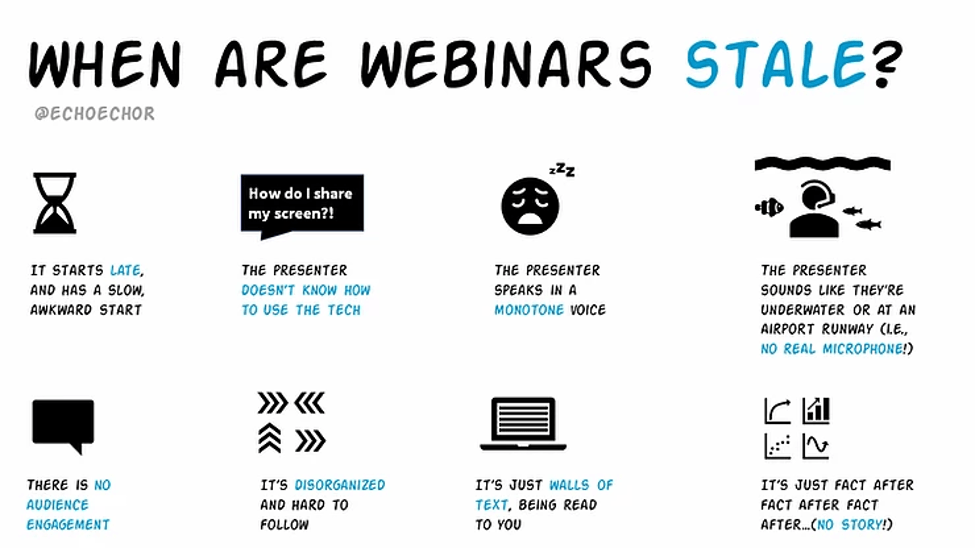
What makes a webinar presentation feel STALE?
If you’re reading this blog post, then I’m willing to bet a year’s worth of coffee you’ve experienced a stale and boring webinar. Some or all of this will probably sound familiar to you:
- The late and slow, awkward start.
- Watching, in drawn-out horror that the presenter thinks we can see their slides (or screen) when we cannot.
- Trying to stay away while the presenter speaks in a monotone voice.
- Struggling to understand what the presenter is saying, because it sounds like they’re either underwater or at an airport runway (or both).
- Trying to stay engaged, even when there is little to no engagement with you from the presenter.
- Trying to keep up with the presenter, but it’s disorganized and you’re struggling to follow along.
- Feeling like it’s a waste of time being there, because the presenter is just reading their wall-of-text slides to you.
- Trying to stay engaged, but it’s just fact after fact after fact (or graph after graph after graph).
That’s probably why 99.99 percent of my conversations on social media these days are from people asking me, “Echo! How do I design effective webinar slides? Do I use less or more slides? Do I use less or more visuals? Animations? Please, I don’t want to be like all those other webinar presenters!”
I LOVE getting this question, because I get to blow people’s mind with the shockingly simple answer.
Before I reveal the answer, let’s back up a quick second.
The underlying assumption with this question is that there is something fundamentally different between in-person presentations and webinars. And, reading between the lines, many people think there’s something wrong with webinars. They think webinars are harder to design well and are less engaging than in-person presentations.
But, is that true?
Imagine the last in-person presentation (e.g., conference presentation, keynote, class lecture) you went to. Chances are, it was a #DeathByPowerpoint kind of presentation where (a) the presenter was using one of those default PowerPoint templates, (b) the slides were crammed with text, and (c) all the graphs were just the default settings or impossible to read because they were screenshots taken from manuscript graphs. And, of course, the presenter mostly just read their slides word by word to you.
What did you do?
Did you continue to look at the slides that were being read to you? Probably not. You probably checked your email, twitter, etc and ignored the slides and just watched the presenter.

Best case scenario, the presenter had so much energy and enthusiasm that you almost forgot about the terrible slides sitting next to them.
In other words: for in-person presentations, we usually have a backup option: we can ignore the slides and watch the presenter to stay engaged.
But in a virtual presentation, we lose that option!

So, now, all of a sudden, we’re no longer able to ignore (or forget) the ineffective slides. And, because everything is online now, all at once, we can no longer ignore the widespread problem of #DeathByPowerpoint in scientific presentations. That’s why it feels like there’s something wrong with a virtual or online format. It’s not because there is–it’s because with everything being online right now, it’s making us finally see the true negative impact of ineffective presentation slides.
So how do you create an effective and engaging webinar? You create an effective and engaging presentation. Period.
Create an effective, visually engaging presentation. Period.
I know. It’s wild, right? That it’s truly that simple! But go back to the reasons why a webinar is stale. None of them are exclusive to webinars – they apply to in-person presentations, too.
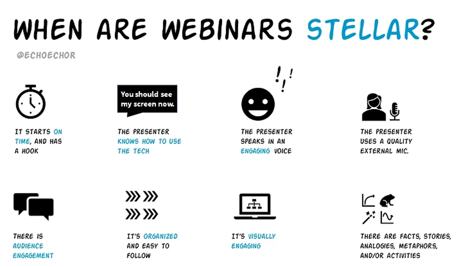
So here is what an effective and engaging webinar looks like:
- It starts (and ends) on time, and opens with a strong hook.
- The presenter knows how to use the tech.
- The presenter has passion and enthusiasm when speaking.
- The presenter is using a quality microphone (yes, even needed in many face-to-face presentations!).
- The audience is actively engaged throughout the presentation.
- The talk is storyboarded appropriately and easy to follow.
- The slides are highly visual.
- The presentation isn’t just a “data dump,” but includes a variety of information types (analogies, metaphors, etc).
See how all of these still apply when you replace “webinar” with “in-person presentation?” At the foundational level, effective presentation strategies apply regardless of delivery type (webinar, in-person, pre-recorded video). If you invest in your presentation skillset, then you will be investing in your ability to present effectively regardless of delivery type.
But surely, Echo, there must be at least some differences? Surely you aren’t saying they’re identical.
Correct. There are some minor differences, but those usually apply to the way you engage your audience (because you need to use different tech to do it) and differences in your equipment. Let’s talk about that equipment piece now.
Get the right gear for your webinar presentations
After attending just a couple of virtual conferences, I noticed a widespread problem where presenters did not have the equipment they needed to deliver a stellar webinar. A potentially powerful presentation ultimately made less of an impact simply because the presenter didn’t have the proper gear, and I don’t want that to happen to you.
You have important research to share, and it would be such a shame for that to make less of an impact simply because you were missing some equipment!
The first thing to significantly improve the quality of your virtual presentation has nothing to do with your slides, but your audio. The first thing to do is to get a microphone and needed accessories. The number one microphone I recommend is the ATR 2100x (not the popular mic everyone else has told you to buy).
In the virtual conferences I’ve attended so far, most were not using a real microphone. Instead, they were using Apple headphones, Apple EarPods, a headset (where the headphones and mic are one piece), their webcam mic, or their computer mic. While those devices can be okay for calls with friends or family, the audio quality is not satisfactory for a professional conference presentation. If you think I’m exaggerating, then watch this video I made to demonstrate how terrible the sound quality of Apple headphones, default computer mics, and webcam mics can be — and how much better it is when you have a real microphone. I want people to enjoy listening to you, not struggle to listen to you.
Additional gear that can be helpful for presenting in a virtual format includes:
- An ethernet cord (don’t rely on WIFI!)
- A second monitor (so you can see your notes and upcoming slides)
- An extra device (so you can keep an eye on the chat)
- Headphones
- A webcam
- Lighting equipment (or strategic use of natural lighting)
Want to learn more about creating stellar webinars and course videos? Grab my free checklist!