Showing Real Vision: From Data Visualization to Data ‘Sensification’
Data visualization and exploratory data analysis have been recognized in recent decades as important parts of statistics and, with the development of tools to routinely produce high-quality infographics, they have become central public-facing aspects of statistics and data analytics. Visualization is important for a few reasons: communication of data and research findings; exploration that reveals anomalies and unexpected patterns in data; and evaluation of complicated models. In short, statisticians and analysts use visualization tools to not just sell their work with pretty pictures, but to find problems with their models and construct new procedures as part of data-analysis workflow.
But visualization excludes people with visual impairments, an increasingly important issue as the population gets older. How can statisticians and analysts provide some of the benefits of the dataviz revolution? There have been some direct steps, such as the use of colorblind-friendly palettes and screen-manipulation tools that allow images to be magnified at will so users with weak vision can navigate an image to see details. Awareness of the natural range of visual acuity can motivate statisticians, and graphic designers more generally, to consider principles of communication and information transfer. For example, there is no reason why all the information in a data set needs to be crammed into a single graph. A grid of plots can show patterns more clearly, and a person with weak vision can first see the big picture on the grid and then focus on individual plots.

Just as sidewalk curb-cuts can improve the daily commute of pedestrians and cyclists, as well as people who transport themselves using wheelchairs, steps motivated by the need to communicate with people with low visual acuity can result in broad-based design improvements. In addition, awareness of this one dimension of diversity within the communities of statistical analysts and users can help them think about dimensions of variation in these populations.
The next step beyond making statistical graphics more accessible is to go beyond visualization entirely and consider “sensification,” or “vivification,” using senses other than sight. This is a wide-open area. To start with, we want to go beyond traditional notions of the five senses and consider other forms of perception, including the muscular resistance sense (haptic feedback) and balance and kinesthetic senses (as with Wii technology), as well as sound and touch, which are the most obvious alternatives to visual communication.
Direct mapping from vision to these other senses will not be possible: there is no obvious way to convert a scatterplot, for example, to a “readable” sonic signal. A pinboard would be able to translate an image to something that can be felt, but at a much lower resolution than most people’s vision. On the other hand, communication can be dynamic, and voice dialogue can be applied so users can ask questions to zoom in and get the distinguishing details they need. The nonvisual senses convey much less information per second, but they do have unique advantages in human communication. Sound perception, unlike much of vision, does not require conscious attention, which is why we can listen to the news or to music while we clean the dishes. This suggests the possibility of data sonifications that run in the background while we work. Sound also has a time dimension that could make it a natural choice for monitoring iterative processes, which are characteristic of much modern statistical computing. The clash of timbres can represent poor mixing of processes, with different sorts of pings corresponding to places in which algorithms are getting stuck or yielding questionable results.
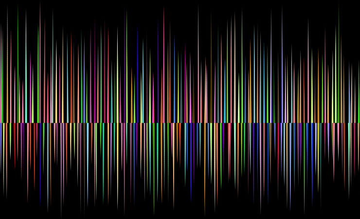
Music can also reach us on an emotional level in a different way than visual images. Marina Koren, in The Atlantic article “The Spookiest Sound in Astronomy,” gives an example of a sonification in astronomy produced by data perception researcher Kimberly Arcand that engages the emotions (“a spooky, cosmic wail”) in a way that maps to underlying “wavelike movements” arising from the pulsing of a black hole. As with other examples of exploratory data analysis, this pattern was not originally anticipated but made perfect sense once it was vivified.

From a different direction, the muscular resistance sense offers the possibility of immediate feedback, which is not easy to do with visual displays and could be useful for exploring model fitting to the extent that challenges in the fit could be represented by physical resistance in the haptic controller. Indeed, visual mouse-based drag-and-drop tools can be considered a crude and not very effective imitation of the two-way engagement characteristic of muscular resistance and body movement, similar to the way infants interact with the world around them compared to the capabilities of adults.
The goal is to understand the advantages of the different senses and optimize them within a statistical workflow, not to simply try to replace visual cues with other senses—or vice versa. For example, we are so paper-based as a culture that music, our cultural organization of pleasing sound, is communicated on paper and we have not updated that because of errant backward compatibility.
Again, new ideas of sensification are appealing in part for their direct potential in making quantitative data analysis and modeling tools available to the visually impaired, and also as an example of the way in which efforts to improve inclusion can potentially yield benefits to the general population. That said, this is all research—that is, as noted in the article “Delivering Data Differently.” But we have to start somewhere.
Right now, there is already sophisticated hardware and software available that could allow new sensification tools to be developed, tools we hope will allow vision-impaired researchers and consumers to make more effective use of statistics and broaden traditional visualization so it is more effective (e.g., sonifications that can keep us informed while running in the background and voice dialogue and haptic feedback that allow us to interact directly with data and models). We also should consider how these tools might be assessed once they are developed.
Many open questions remain with visual displays. For example, in what settings is exponential growth best presented to the general public on a log scale? As statisticians, our ideas about evaluation and communication develop in tandem with new methods.


