People Do Not Understand Logarithmic Graphs Used to Visualize COVID-19
Editor’s Note: If you’re curious about the ways in which data visualization and graph use can generate impact with regard to the coronavirus, please also check out our other recent post, “How Can Wise Graphics Use Cut Through the Complexity of COVID-19?“
Mass media routinely portray information about COVID-19 deaths on logarithmic graphs. But do their readers understand them? Alessandro Romano, Chiara Sotis, Goran Dominioni, and Sebastián Guidi carried out an experiment which suggests that they don’t. What is perhaps more relevant: respondents looking at a linear scale graph have different attitudes and policy preferences towards the pandemic than those shown the same data on a logarithmic graph. Consequently, merely changing the scale on which the data is presented can alter public policy preferences and the level of worry, even at a time when people are routinely exposed to a lot of COVID-19 related information. Based on these findings, they call for the use of linear scale graphs by media and government agencies.
The fact that the framing of information can dramatically alter how we react to it will hardly surprise any reader of this blog. Incidentally, the canonical example of framing effects involves an epidemic: a disease that kills 200 out of 600 people is considered worse than one in which 400 people survive. Whereas this imaginary epidemic was just a thought experiment, an actual global pandemic turns out to be an unfortunate laboratory for framing effects. In a recent experiment, we show how framing crucially affects people’s responses to one of the most important building blocks of the COVID-19 informational puzzle: the number of deaths. We show that the logarithmic scale graphs that the media routinely use to display this information are poorly understood by the public and affect people’s attitudes and policy preferences towards the pandemic. This finding has important implications because during a pandemic, even more than usually, the public depends on the media to convey understandable information in order to make informed decisions regarding health-protective behaviors.
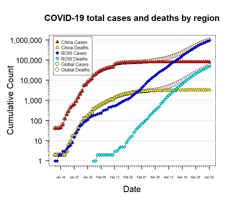
Many media outlets portray information about the number of COVID-19 cases and deaths using a logarithmic scale graph. At first sight, this seems sensible. In fact, many of them defend their decision by showing how much better these charts are in conveying information about the exponential nature of the contagion. For history lovers, the popular economist Irving Fisher also believed this, which led him to strongly advocate for their use in 1917 (right before the Spanish Flu rendered them tragically relevant). Fisher was ecstatic about this scale: “When one is once accustomed to it, it never misleads.” It turns out, however, that even specialized scientists don’t get used to it. Not surprisingly, neither does the general public.
We conducted a between-subjects experiment to test whether people had a better understanding of graphs in a logarithmic or in a linear scale, and whether the scale in which the chart is shown affects their level of worry and their policy preferences. Half of our n=2000 sample of US residents was shown the progression of COVID-19 related deaths in the US at the time of the survey plotted on a logarithmic scale. The other half received exactly the same information–this time plotted on a good old linear scale.

Contrary to Fisher’s optimism, we find that the group who read the information on a logarithmic scale has a much lower level of comprehension of the graph: only 40.66% of them could respond correctly to a basic question about the graph (whether there were more deaths in one week or another), contrasted to 83.79% of respondents on the linear scale. Moreover, people in the logarithmic group also proved to be worse at making predictions on the evolution of the pandemic: they predicted, on average, 71,250 deaths for a week after the experiment was taken, whereas the linear group predicted 63,429 (our ARIMA forecasting model indicated 55,791, and the actual number of deaths on that date was 54,256). Nevertheless, respondents in both groups stated a similar level of confidence in their answers.
Furthermore, we tested whether the scale used affects the respondents’ attitudes towards the pandemic. It looks like it does. First, we find that despite predicting a higher number of deaths, people who were shown the logarithmic scale chart declare to be less worried about the health crisis caused by the coronavirus.
Divergences, however, don’t stop there. The scale of the graph they see affects people’s responses concerning their policy preferences and stated behaviors. Ceteris paribus, respondents who see the information on the linear scale graphs support less strongly the policy of keeping non-essential businesses closed than those who look at the logarithmic one — although they also favor reopening them later. At the same time, those who see the linear graph are more willing to support a hypothetical state-level tax aimed at providing citizens with masks.
A possible explanation of our finding is that the linear scale gives the impression of a growing pandemic, without any sign of improvement. At the same time, the curve on the logarithmic scale looks flatter and reassuring. However, it has a higher end-point value on the Y-axis, which might act as an anchor when assessing the short-term evolution of the pandemic. Therefore, while the logarithmic group predicts more deaths in the short term due to the higher anchor, the linear group expects the crisis to last longer. Consequently, the linear group is more worried about the health crisis, while anticipates to wear masks less often in order to ration them.
Admittedly, we cannot know which policy preferences are superior. However, we do know that unlike the people who saw the graph on a logarithmic scale, the people exposed to a linear scale graph can form their preferences based on information that they can understand better. This is a strong enough reason to suggest that mass media and policymakers should always describe the evolution of the pandemic using a graph on a linear scale, or at least they should show both scales. After all, if we want people to wash their hands and keep six feet from each other, they better understand what’s going on.