How to Present Data Effectively: An Example
This how-to by information designer Stephanie Evergreen first appeared at SAGE Connection.
***
Why even present data at all? Why bother to get up in front of a crowd with a set of graphs and some speaking points that we labored several hours to prepare? Sometimes we go through that process to bulk the resume or to justify tenure. More commonly, I suspect, we develop visual depictions of our data for others to see because we want them to understand our work. We want them to see the data, to think about it, and to walk away from it with a clearer idea of our research. But if that’s the case, why do so many graphs look like Graph A (below), a default Excel line graph that probably looks very familiar to you?
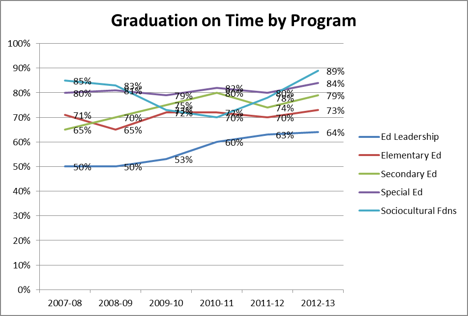
Compare Graph A to Graph B, also made (and tweaked) in Excel:

Same data, same line chart, but what’s the difference?
Well, you might at first think that the second graph is, simply put, more simple. But what kind of an effect does simplification have for the viewer? Let’s take a closer look by walking through some of the major changes I made to get from Graph A to Graph B.
In Graph B, I reduced the appearance of data labels on each point in each line, keeping labels on just the beginning and end points as these values are the ones that matter most to audience members. The overlapping numbers in Graph A impaired legibility and made it difficult to see the trends in the lines (the whole point of data visualization).
I also removed axis labels, keeping only the end points on the x axis. In a case like this, everyone knows what comes in between those end points. Reducing unnecessary text removes clutter and unwanted distraction from the actual data. You may also have noticed that I deleted the y axis altogether. Viewers need data labels or gridlines, but not both. Gridlines are especially tricky on a line graph, because they can be confused for the actual data lines.
More deleting: I deleted the legend and placed the correct labels in textboxes next to their corresponding lines. Legends can actually get in the way of cognition and separate legends put the viewer in a position of having to look back and forth to match up each line with its proper legend entry which interrupts the viewer’s working memory.
If you noticed that I’ve been taking away a lot so far, you are correct. First simplification…now emphasis. I changed the generic title to a complete sentence which encapsulates my overall point of presenting the data. I also added back in an annotation – that little speech bubble, directing attention at a specific data line where action is needed. With these changes, there is little chance that a viewer can misinterpret my data.
Alternatively, I could ditch the annotation and emphasize my point in another way. I could capitalize on the grayscale I brought to the color scheme by switching whatever my most important data line is to some action color, like bright red. Color is a powerful way to direct eyes and brains, but it won’t work with the default rainbow color scheme assigned by Excel. As with the rest, when it comes to color, think simplification and then emphasis.
We should work to present data more effectively so that our work is easily read, comprehended, and understood. Simplification of the graph followed by selective emphasis supports a viewer’s focus, hones her in on the key points in the data, and better positions the bottom line to stick in her mind for the long term. Sure, the first graph took me about three seconds to construct and the second one took me three minutes, but that small investment of my time pays off in increased understanding for my audience. That’s the power of presenting data effectively!